Driving Engagement Through Better Navigation
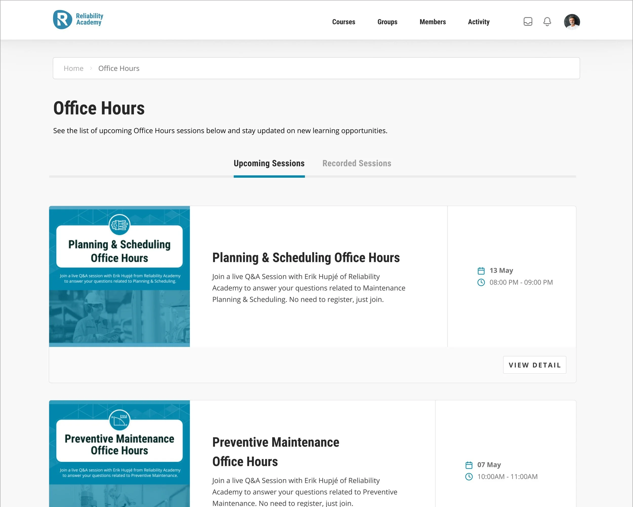
Reliability Academy needed a clearer way to present Office Hours sessions, but users struggled with confusing filters and poor content discoverability. I redesigned the experience using Figma wireframes and internal usability feedback, replacing dropdown filters with intuitive tabs for Upcoming and Recorded sessions, updating event details, and adding related session widgets. The result was a cleaner interface that made it easier for users to find and engage with session content.
Project type: Small scale project
My role: UI UX Specialist
Target users: Enrolled students at Reliability Academy
Contribution: High-fidelity prototype
Outcome: Under development
Duration: 2 weeks
The Before
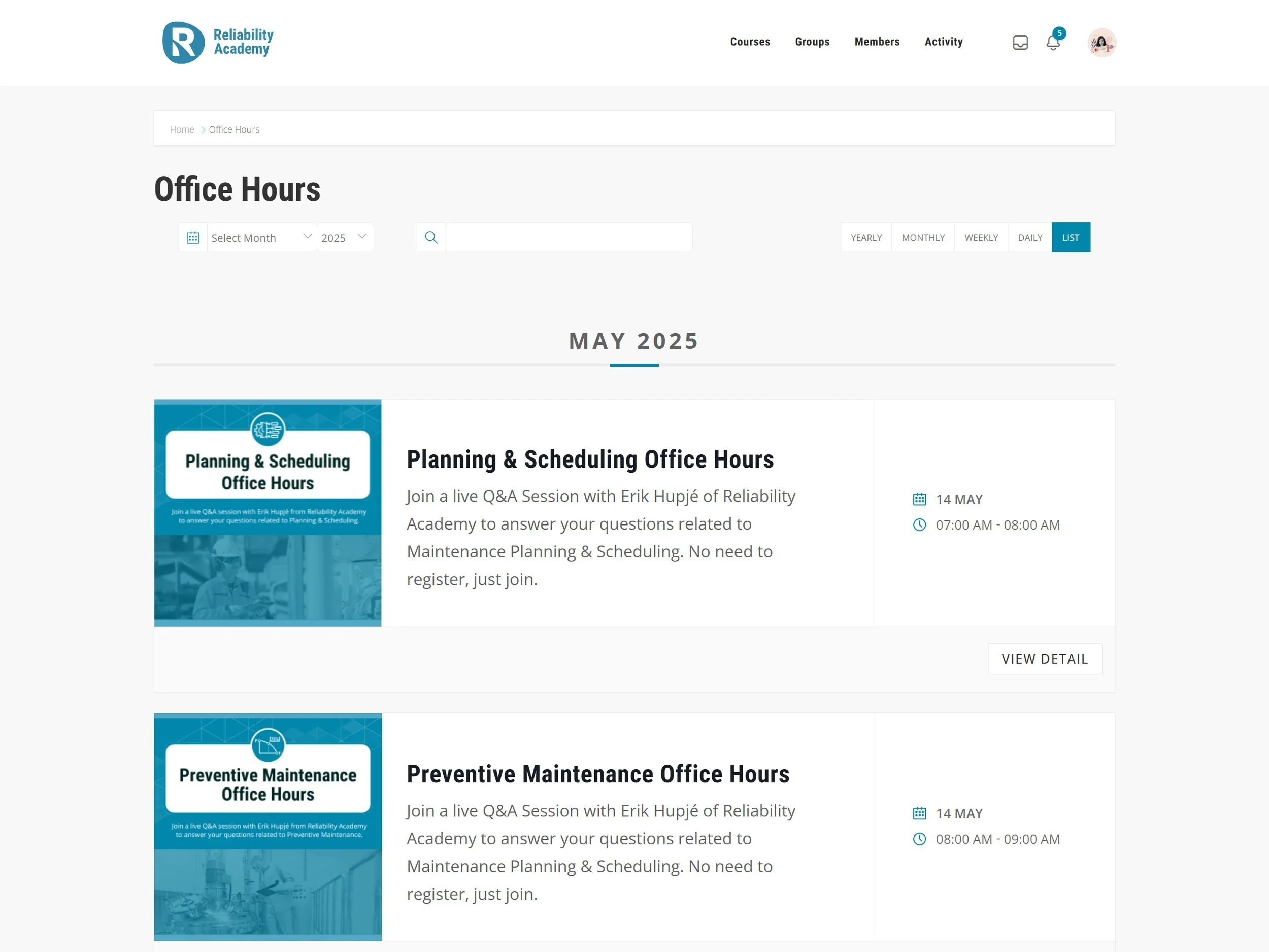
Event list page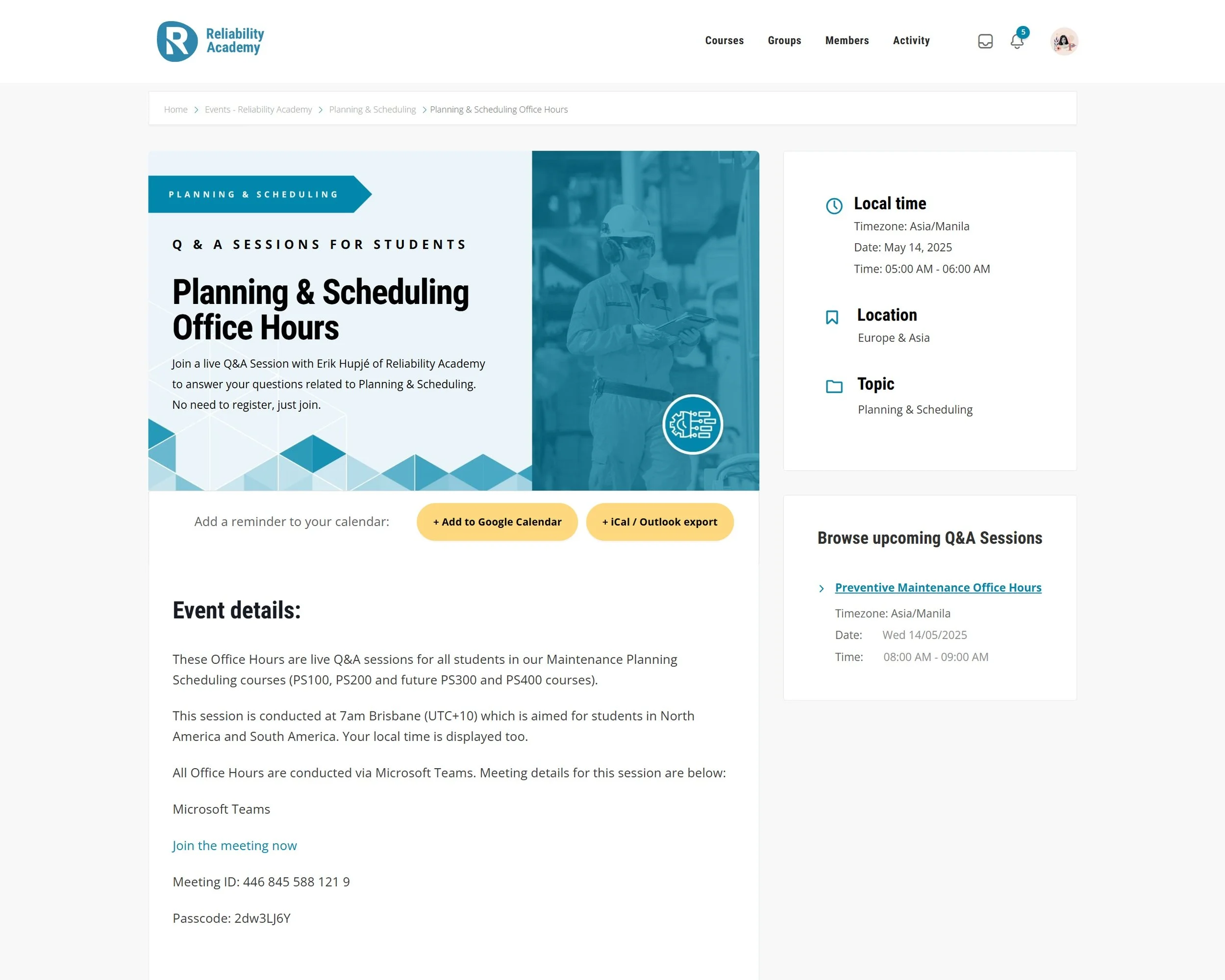
Event dedicated pageProject Scope
As the UI UX Specialist of Reliability Academy, I was given the following requirements:
Replace the Select/Search filtering function with tabs.
A tab page showing a list of the upcoming office hours sessions.
Another tab for the recorded sessions.
For past sessions, when clicked takes to a page with the grain recording and meeting notes, etc.
On the Event page, Replace the Select/Search filtering function with tabs. Replace the “Local Time” headline with “Date”
In the side widget of Browse Upcoming sessions, update to have 3 or 4 related sessions (PS sessions for a PS event page and PM sessions for PM event page)
Process
The initial requirements were straightforward and well-defined, allowing for a UI-focused design approach. Given the timeframe, I promptly delivered the first design iteration. However, I chose to go beyond the initial scope by exploring the user experience more deeply to create a solution that better meets the needs of our users.
To gain some depth of the project, I asked further team members involved in this project, and developed a part of Project Requirement Document for our reference. This gave me a wider understanding of the problem that we are solving and had a better insights of what things that are missing in the initial project scope.
To define user needs and understand user’s mental models, I referred to the user persona document.


To ensure the project progressed smoothly, I maintained regular communication with cross-functional team members and proactively sought early feedback to review and iterate on my work—especially important given our tight deadline.
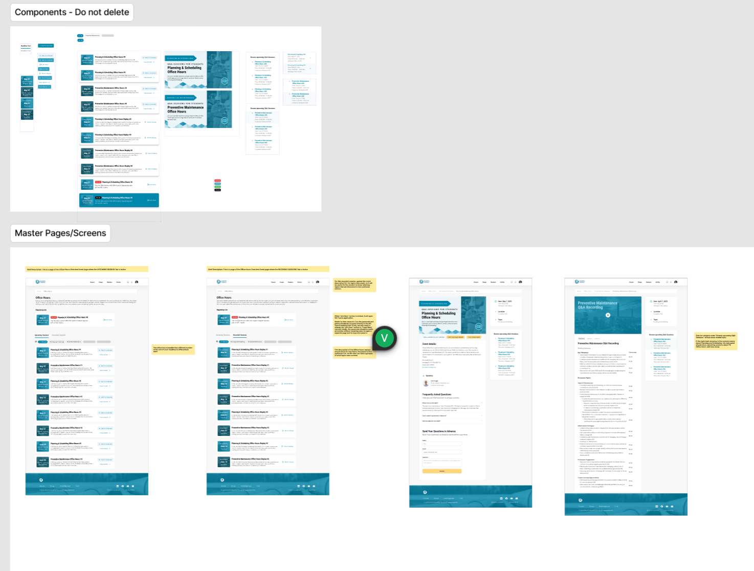
I also ensured proper documentation and thorough note-taking within Figma to account for all necessary UI states during development. Additionally, I created user flows to illustrate the behavior of each screen when actions, such as button clicks, occur. While these could be presented in a prototype, I opted to create a storyboard-style layout to provide our developers with a comprehensive and easily scannable reference.
The Result
Success metrics
Engagement rate
How many students attended the Office hours via Learn site?
Clicks on “Add to Calendar” buttons
Overall satisfaction rate
User feedback post-launch (via optional survey or support email volume)